Not all criticism is created equal. You have your constructive feedback—suggestions that highlight ways to take your work to the next level. You have your negative feedback—when someone doesn’t like something for a specific reason. Then, you have your nightmare feedback—the last-minute changes, the unfounded jabs of disapproval, and the vague internal conflicts that can’t quite be put into words.
Well, here’s something that can be put into words. In honour of spooky season, it’s a list of feedback that gives graphic designers nightmares.
“I don’t like it, but I don’t know why.”
Designers can do a lot of things, but unfortunately, we can’t read minds. It takes constructive feedback to hone in on the client’s personal vision. While we’ve all given feedback before, the constructive part can be a challenge to some, as evident in the classic comment, “I don’t like it but I don’t know why.” This sort of ambiguous feedback is soul-sucking, as it doesn’t give any direction to get closer to the client’s vision.
There’s nothing wrong with not liking something, but improvement depends on your ability to articulate those feelings. If you’re struggling to do so, take a step back and digest the project before giving your feedback. If the uncertainty stems from the designer’s decision-making, ask about their process. Why did they choose that font? Why did they pick that colour? With this context, you might come around on the design, or at least gain an understanding of where things strayed from what you’re looking for. The more specific you can be with your feedback, the better your designer can bring your vision to life.

“Can you reduce the amount of white space?”
White space is often mistaken for wasted space. But that’s far from true. White space is just as essential to the design as the graphics themselves. White space creates breathing room that makes the design more digestible. It helps direct the eye and influence the user journey. You don’t always need to fill space when it’s empty. In fact, simplifying a design and reducing its elements can actually improve the impact of your message.
“Can you make it pop more?”
The dreaded “pop” question is a scary reality for many designers. Often following the previous feedback, it’s an appreciated but failed attempt to be specific. We all have different ideas of pop and we all have different scales of measuring it. That’s why it’s a good idea to consider what exactly isn’t popping and why. Is it a lack of colour contrast? Is the messaging too long? Communication is key to providing tangible feedback that puts your designer in a position to be successful.
“I have one more quick change.”
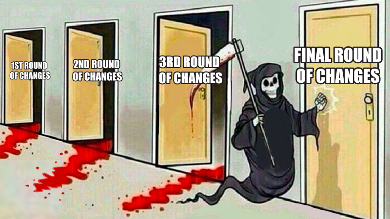
Just when you think a project is finished, you get that final request. Then you get that final final request, followed by the I-promise-this-is-the-last-thing request. It’s not uncommon to have a few rounds of revisions for a project. Great design requires collaboration and fine-tuning. However, launch anxiety is real and it can lead you to obsess over insignificant details that end up dragging things out.
Furthermore, while something may seem like a small change, it could have a ripple effect that creates more problems. When that ten-word headline gets cut down to three words, suddenly the banner is looking really empty. Maybe it’s too big? Do we even need a banner now?
See what I mean?
Ask yourself and your team what’s more important—making the update or meeting your deadline. If it’s the update, take some time to review the rest of the work to ensure there’s nothing else that needs fixing. By grouping your feedback you’ll help limit the amount of back and forth and as a result, save time and money on the project.

“Can you get this done ASAP?”
We understand that everyone has people to answer to and everyone has things pop up, but imagine telling a chef you want the chicken paella, but you need it in five minutes. Sure, they might pull it off, but you might also get food poisoning. Good design takes time, so it’s best to plan as much as possible to ensure deadlines can be met without sacrificing quality. Factor in revisions, roadblocks, and all those last final final requests.
“We don’t have the content finished, but can you start on a design?”
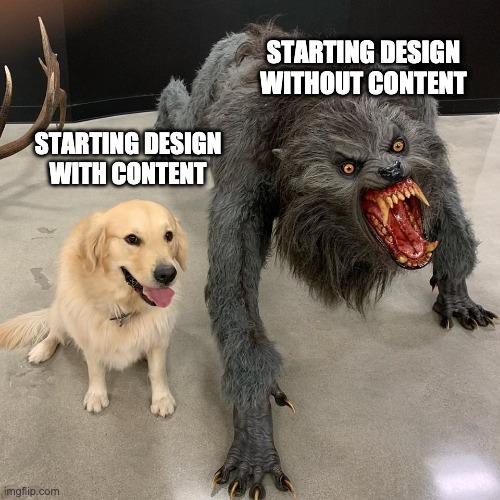
A big challenge I often face is working with little to no content. It might seem like you’re saving time by getting started with the design first, but it can often go the other way—spending time on a design that winds up changing to better support the content. That’s because without knowing the content, your designer can’t properly tailor the layout and overall experience to accommodate it. We can work with placeholders and lorem ipsum, but it’s like buying a suit off the rack that’s two sizes too big then trying to tailor it to fit you properly instead of just providing your measurements to begin with.


0 Commentaires