We recently shared a few useful tips and tricks to speed up your InDesign process. InDesign is chock full of clever shortcuts, so this is a series that really could go on forever… but we won’t do that. Instead, we will simply present part two: just a few more of our tried and true favourites.
Here at Curve we love working on magazines, programs and brochure design. When working on a multi-page document, we want to make it as easy as possible to ensure consistency across pages, so that we know our creations are clean and organized, and so that we don’t find ourselves—or our clients—looking at uneven margins, conflicting punctuation rules, or shifting headers and footers. Below we’ll share some of the ways we do this.
1. Customize Your Workspace
Once you start to get comfortable in InDesign, you begin to notice some preferences and patterns in terms of which tools you’re always reaching for, so it’s super helpful to have them all ready at your fingertips. Luckily InDesign makes it easy.
For example, when designing a magazine for a client, I know that I always want access to the Pages panel, as well as Layers, Paragraph and Paragraph Styles, Character and Character Styles, Stroke, Effects, Text Wrap, and Swatches.
These are not the default Tools that InDesign provides, so I need to create a custom workspace so that every time I open the program, I can quickly pull them up. Here’s how:
a) First, go to the top of the screen and click on Window. Select each of the tools you want to bring into your custom workspace. It will look pretty messy at first, but don’t worry – you’re about to clean that up.
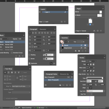
b) Now you get to organize them. Simply drag the window panels one at a time to the sidebar on the right of your InDesign screen—all the way to the right until you see a blue vertical line appear, and then release it there. Drag each panel in this way, in the order you want them to appear. You can click on the double arrows at the very top right of this sidebar to switch between a collapsed view and an expanded view of the tool panels.
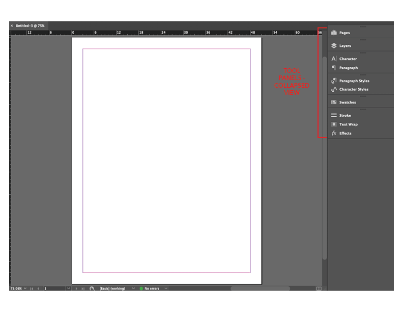
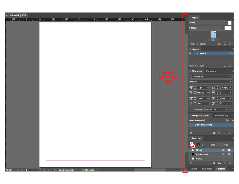
c) Note that you can put multiple panels in the same box, as I have done with Paragraph Styles and Character Styles; or Stroke, Text Wrap and Effects, as these are tools I tend to use at the same time, so they might as well be stored in the same place.
d) Once you have your workspace set up how you want it, click on “Essentials” at the top right of your InDesign window. Scroll down to “New Workspace” and name it whatever you like. Next time you open InDesign, you can choose your custom workspace and save yourself time by not having to look for the tools you love to use!
2. Make Use of Master Pages
When you’re working on a multi-page document like a magazine or perhaps an event program, there are certain design elements you will want to consistently apply to each page. Things like page numbers, headers and footers, margins and guides, logos and other graphic elements, text or graphic boxes, and so on. Save yourself time by setting these up in Master Pages, so that they will automatically apply to the individual pages you create—and importantly, they won’t move around! Here’s how to do it:
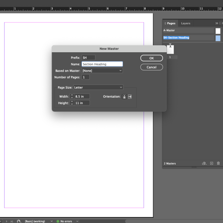
a) You can easily double click on “Master Page” in the Pages panel to get started. Or, if you’re creating multiple master pages, you can choose “New Master” from within the Pages panel. Choose a name (ie “Section Heading”) and an easily-identifiable prefix (ie “SH”) for the master page.
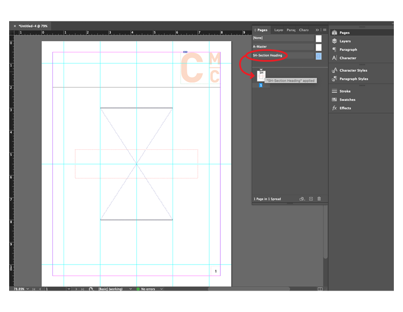
b) Next, set up the elements you want to appear each time you need to create this type of page. In the example below, I’ve created a master template that includes guidelines, an image box, a text box, a header containing a logo, and a page number that will automatically update for accuracy (more on that in tip #3).
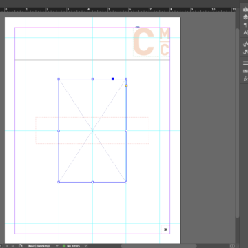
c) Now anytime you want to apply this master layout to an individual page in your document (for example, to create an actual section header page), you will just drag that master page icon (in this example, the one marked “SH”) over the page you want to apply it to.
This will put all the text frames, image frames, and guides right onto that page, and you can be confident knowing that the placement will be consistent every time you use this master layout. You can now fill in the individual pages with the relevant content.
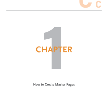
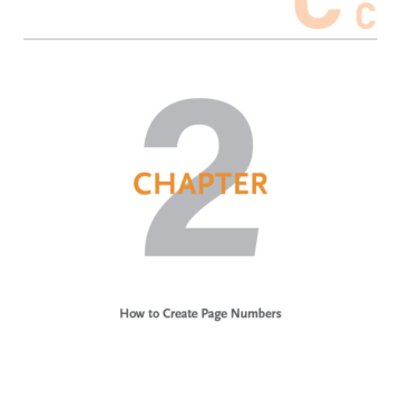
d) Note that if you ever want to remove an entire master page setup from a page, you can simply drag the master icon marked “None” overtop of the individual page and it will override the master previously applied and remove all of the master settings on that page. If you ever need to remove just one element from the master template—for example if you don’t want a page number to appear on a particular page but you do want the rest of the master template to apply—just choose “Shift + Cmd,” click the box with the page number in it, and hit “delete.”
3. Apply Page Numbers in the Master Page
When designing a multi-page document, sometimes those pages end up moving around after the bulk of the design is done. Not having to think about renumbering the pages is just one of the benefits of using the “Current page number” placeholder feature on your master page(s). Here’s how to insert that placeholder so you don’t even have to think about it again.
a) In your Pages panel, open up the master page and draw a text box where you want the page numbers to appear.
b) With your cursor inside that text box, click on “Type” > “Insert Special Character” > “Markers” > “Current Page Number.”
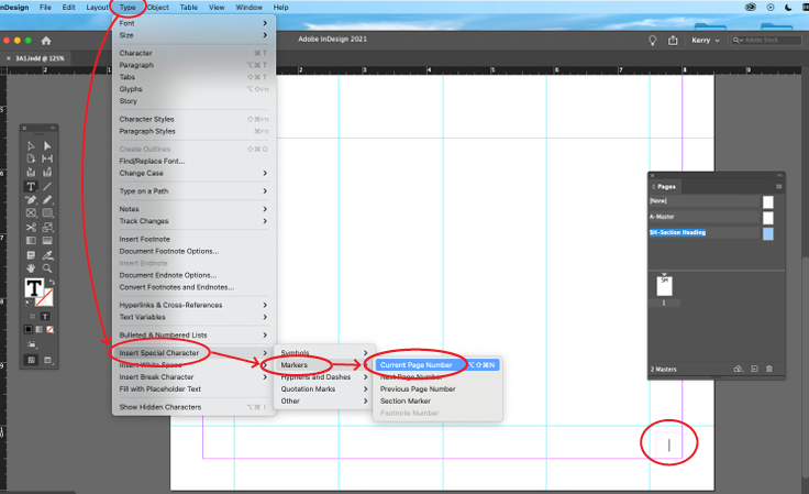
c) You can now format the style of the page number as you would with any other text: change the typeface, size, colour, paragraph alignment, etc to suit the style of the rest of your document, and know that on all pages with this master applied, the page number will populate accurately and with all formatting applied consistently.
0 Commentaires